I went on to then include logo's and tags of social media, such as Facebook and Twitter, to create convergent links that are so popular with young people. Using convergent links appeals to my target audience of young people/teenagers as they are into social networking. Also, the involvement of social networks will help to widen my target audience by increasing the popularity and accessibility of my magazine online. It also helps my target audience to be proactive and search for more information about the school.
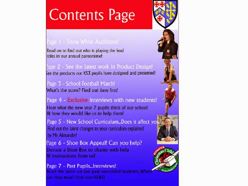
Finally, I included a logo of the shoe-box charity appeal as it fits in with the season of my edition of the magazine 'winter' - as in the winter term at school, we donate to charity; this helps to promote our Catholic ethos which is so important to the school's identity.
Production Process:
As a class, we organised photo -shoot and took a range of original photographs using a digital SLR camera; we captured various events and classes within the school community in order to represent a wide range of activities and students.
In order to produce my magazine, I edited a range of pictures to produce my magazine cover and contents page using an industry specific program, Photoshop.

Here I made the background fade from white to blue using a gradient tool on Photoshop. This would make my magazine look more intriguing instead of being one plain, block colour.

In order to produce my school magazine to a professional standard, I included a range of my own images and also found images to feature on my front cover and contents page. My own images are of other students taken on a professional SLR camera and the found images used are mainly social media buttons (to widen my audience and create convergence between multiple media platforms, in this case social media), the school logo (to create my own brand identity and to widen my audience again to other institutions and perhaps Ofsted), a barcode (to follow the typical conventions of a magazine) and also the shoe-box appeal charity logo which is a charity supported in our school which will, again, help my magazine to connect effectively with my target audience. Some images I didn't use in my magazine and I have included some options which I didn't use, however these were still just as useful in the process of creating my magazine. Here are the images:


In order to produce a realistic school magazine which identified with its target audience, the cover lines and copy on the cover needed to adopt a friendly, informative tone. I achieved this with using rhetorical questions, such as 'How does the new curriculum affect us?' reminding my audience that we are a community and thus making them feel a sense of belongingness. My central image for the magazine cover is friendly and inviting, as it is a student looking directly at the camera (showing direct mode of address).
Cover lines such as 'See the latest work in product design!' would interest and engage the target audience because it starts with an imperative verb; linguistic devices such as 'See' is a demanding word which subconsciously creates the effect of my readers wanting to find out more. Also, the product design story is clearly the main story of my magazine, as it correlates with my main central image of a student working - this will interest my target audience as I found out from my questionnaire responses that my audience wanted to see more stories about students doing practical lessons.
A variety of font sizes enabled me to draw the readers' attention to certain areas of the magazine first. For example, the largest font on the cover was my Masthead, which would tell the reader straight away what magazine it is that they were looking at. The second biggest font on my cover is my main story.
A house style was evident between my front cover and contents page because I used the same colour font for my masthead and strapline - white, on a red background. These are the school colours and so represent us as a community with a clear identity.
The only improvement I would suggest if I had to re-make this magazine cover and contents page in the future would be to make the background colour of the contents page exactly the same colour as the background colour of my front cover. The thought process behind this slight colour difference was because I wanted both of my pages to look similar, yet not exactly the same and by making the contents page more of a purple colour as opposed to blue also widened my house style; which I thought would make my magazine more appealing and exciting for my young target audience. However, looking back now I would change this as I think a consistent colour throughout would create more of a professional look. This colour matching was also difficult to do as I was working with a gradient tool which I now know rfor the future that this probably isn't the best tool to use (for me). Nevertheless I'm still fond of my original colour choice as it doesn't look too displeasing on the eye and seems to work. I kept it this way so that I could clearly see how my skills will have progressed after I have completed my Main Task.
I really enjoyed looking through your preliminary task as I feel as if you have a very good understanding of the task set, you clearly understand how to use house styles as you used this very well throughout your front cover and contents page. Your magazine also has a clear identity due to the badge that you have added to your pages it is also very good this you have included relevant pictures and social media badges and their sites handles.
ReplyDeleteWell done buddy, as your work is to top standard.
You have used linguistic devices and the conventions that are necessary for the school magazine.
ReplyDeleteYou have used convergent links to the Facebook and Twitter page.
You have kept to the guidelines and you have regarded to your questionnaire when you was making your magazine.
Well done!
you have used various images on you in your magazine.You have clearly shown that you know the codes and conventions of existing magazine and be bale to forward it into you preliminary magazine.You have use bright colours and kept the house colours the same which give that magazine a professional look.You have also used evidence of your making process.
ReplyDelete