Question 1: In what ways does your media product use, develop or challenge forms and conventions of real media products?
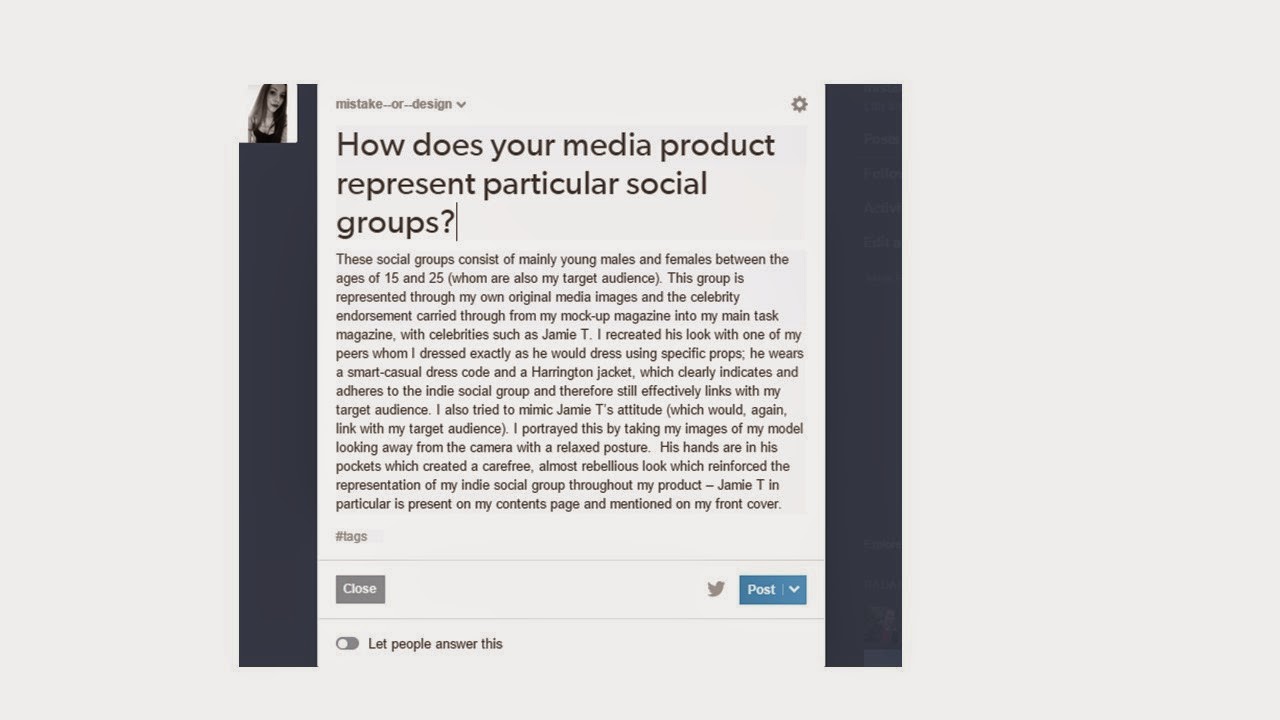
Question 2: How does your media product represent particular social groups?


Question 3: What kind of media institution might distribute your media product and why?
Question 4: Who would be the audience for your media product?
Question 5: How did you attract/address your audience?
Question 6: What have you learnt about technologies from the process of
constructing this product?
Throughout the process of constructing my media main task
product, I have used a range of new technologies which include Photoshop,
PagePlus, a professional digital SLR camera, Slideshare, Prezi and even
Blogger. A lot of my learning process
and experience on Photoshop, PagePlus and the SLR camera is documented on my AS
Media Studies blog, as I demonstrated and published my creation process through
screenshots, step by step through the creation of my front cover, contents page
and double page spread.
To begin with drafting my Music Magazine front cover for my main task, I decided to arrange my sell lines and information for the front cover first by giving myself an idea of the arrangement of my front cover. Also I did this because I liked my previous sell lines from my mock-up front cover although I did edit them slightly.


After I arranged all of the text for my front cover I then decided to add my main image with the same black back-drop which I included in my Photoshoot. After adding my main image it was easier to decide on the colour of the font for my sell-lines; I decided to choose yellow as it contrasts extremely well with the colour black as it is very bright and eye catching, which will draw in my target audience effectively. As I used red lipstick for a prop for my model, I decided to make the font of the main cover-line the same colour as my model's lipstick, which is a deep red. I carried this idea along from my mock-up front cover as I thought it was very effective as it acts as the accent colour by matching with the font of the main cover-line.


To improve my cover I moved the main image and enlarged it slightly so that my main image was central within the front cover and also so that the masthead covers my models head slightly. This makes the masthead stand out much more without taking attention off from my main image as the image is larger and it only covers a slight part of her head.


To enhance my accent colour I also used the deep red font to make the tag word 'FREE' stand out and make it even more noticeable.

I then moved my main cover-line over into the centre in line with my main image so that my front cover looks a lot better arranged.
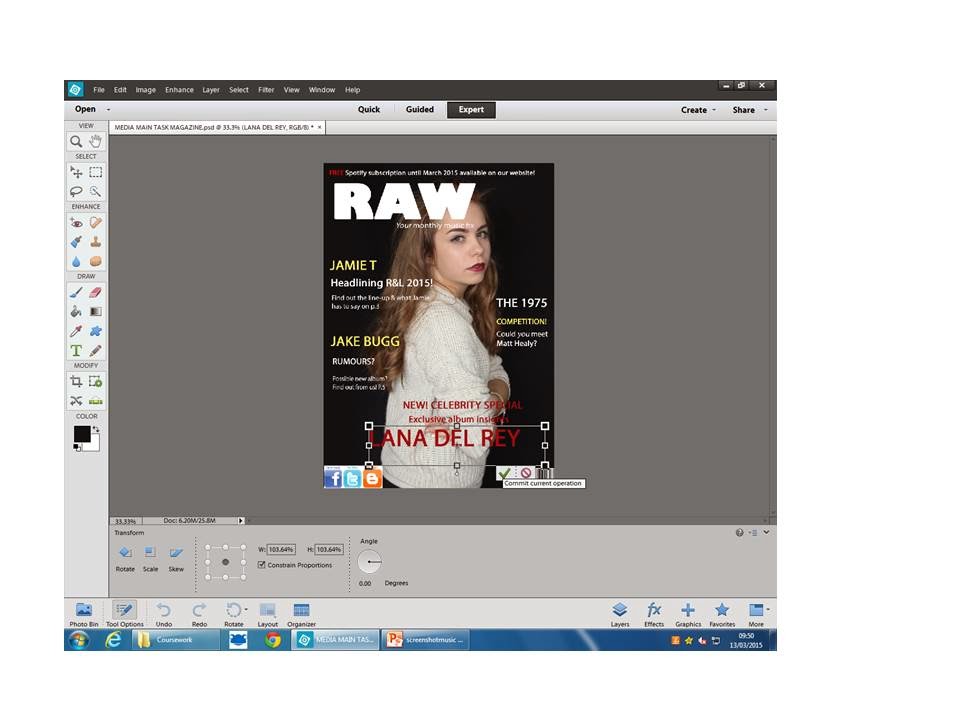
I thought that the social media buttons could be improved as the white background didn't match with my black background on my magazine front cover. To improve, I brought the images of the buttons onto Powerpoint and removed the white from around them using the cropping tool. By cutting the buttons out individually it was a lot easier to put them onto my magazine in an arranged design.

Once I had imported my social media buttons into my front cover, I added the issue number, date and price in the same white font which I used for the sell-lines. Here is my final Music Magazine front cover:

I decided to re-visit my magazine front cover to make some amendments which would make my cover the best that it could be. To do this, I moved my main image across slightly to the right and also moved it down so that there was less of the masthead and strap-line covering my model's forehead.
Here is my final, completed music magazine front cover:

Moving onto my contents page, I decided to first make my logo into a jpeg for easier transition onto pages and to further my brand identity. I did this by print screening my magazine, cropping it out so I was left with just the masthead and saving it as a separate image. Here is my logo:

Before I began my contents page, I decided to edit and enhance all of my pictures which I planned to use on my contents page and double page spread. I did this by opening my images on Photoshop and selecting the tools for image manipulation; I used a range of effects including brightness, contrast, enhance and shadows. Here is my process:


After I'd done this, I had an idea to display my images in a Polaroid frame to make my magazine look more interesting, original and creative. This way, I could use all of my selected images on both pages without making it look too cluttered. I used a jpeg image of a Polaroid frame and imported it into Photoshop.

Once I'd imported the polaroid frame image into photoshop I encountered a problem as my images didn't fit inside the frame I'd selected.

To solve this issue, I cropped the bottom part of the polaroid frame and saved it as a new image so that I could resize the frame so that my image would now fit the frame.

After I done this, I imported all of my chosen images into my personally adjusted polaroid frame on Photoshop. Here are my polaroid pictures which I used on my contents page and double page spread:


I then began to create my contents page. To begin with, I selected my favourite image of my model to feature as my main coverline on my contents page. I positioned the image right from centre, and fairly large. Also I imported my 'RAW' logos onto my page for the folio and slug.

Next, I began to create a black box out where I inserted a larger version of my logo.

I then completed the text in my box out but this time using yellow font, carrying the house style from my front cover over into my contents page also.

I then added the title 'Contents' in a similar black box out (with the same font) and enlarged my image to follow the layout of a Kerrang! magazine (which I annotated in my Main Task - Research and Planning tab). I also added an issue number and date.

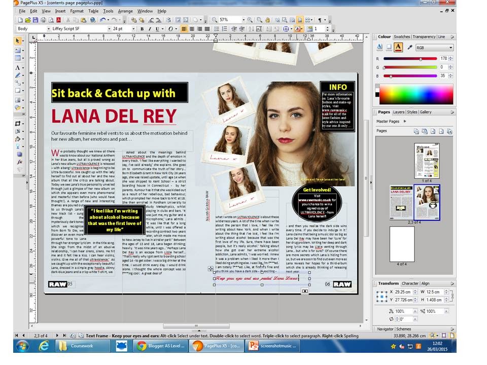
My plans for my contents page, however, changed after I came across a contents page of The Quarterly magazine which I found in class. What I liked about this contents page was the organized and sophisticated layout with the welcoming tone at first glance with the title 'Welcome'. Also, I was font of the editors comment on the left hand column; I felt that this would make my readers feel a closer connection with the magazine and would be an effective technique to use. After the influence of this contents page, I re-arranged and adapted my page to look similar to this, yet original.

I then began to draft my editors comment. As shown in The Quarterly contents page, there is an image above the editors comment which belongs to one of their sell lines in the front cover. I decided to use my sell line including the artist 'Jamie T' for the image above my editors comment.

To make this image look striking, individual and effective I imported it on Photoshop and began to apply effects which I was familiar with, such as brightness, enhance and contrast, as I was confident with the results which would come of it. Here is my editing process:

Afterwards, I imported my edited images into PagePlus and re-drafted my contents page to take the form of The Quarterly magazines' layout. I also typed out a draft of me editors comment to have an idea on the size and the language which I would use to connect with my target audience.

I decided to take a photograph of my signature to add to my editors comment to give my contents page a more professional and sophisticated look. To do this, I took a picture of my signature and uploaded it onto PagePlus. I then cropped it and rotated it to a suitablesize to place beneath my name in my editors column.


After doing this, I re-allocated my previously made box-out heading of 'This week in RAW' and placed it underneath my polaroid picture of my model. I thought this looked better as the column fitted this area perfectly. I then left a space below and placed the 'Contents' heading to mimic the layout of The Quarterly contents page. I then added my contents headings and described what is on each page of my magazine and structured my textboxes in line with my headings, again to make my page look more organised and tidy. To add even more to my page I imported the social media buttons from my front cover and added them at the bottom to make my contents page look more interesting and to re-inforce the convergent links available for my magazine to my target audience.

To finish including my contents of my magazine, I inserted the main coverline contents next to my polaroid frame at the top so that it is even more clearer to my audience which story is my main coverline (Lana Del Rey). I typed this infortmation in my accent colour of deep red to symbolise that the content is of Lana Del Rey and to carry the use of my house style throughout my main task.

A further idea I had whilst constructing my conetnts page was to include Lana's signature on the bottom strip of my poalroid frames in order to make them look more original and to further my use of celebrity endorsement. I chose the deep red accent colour to emphasize my house style and to carry the accent colour onto another page of my main task. Also my accent colour of deep red is only used for my main coverline of Lana Del Rey, which tells my target audience at first glance that this signature relates to my main story in my magazine and on my double page spread.

To do this, I imported my Polaroid frames into photoshop along with a typed red font which I created on www.dafont.com. I liked this font as it looked very feminine and hand written and looked very fitting for a signature.


I then moved my font onto the bottom strip of my poalroid picture. For added effect, I rotated the font so that it was at a side angle, to give the impression of a rushed, yet professional and realistic look.

After doing this, I imported all of my polaroid frames and did the same with the same font. Here are my completed, signed polaroid pictures:


Here I am replacing my old polaroid picture with my new signed one. With the red font, it is clear to see the use of my deep-red accent colour playing an effective role in my house style and making my contents page look professional and original.


To complete my contents page, I included a yellow box-out to advertise a subscription of my magazine to order. The yellow box-out stands out on the page and is very eye-catching which works well to advertise the offer to my target audience. Again I included my 'RAW' logo and used imperative verbs and demands such as 'Get RAW' and 'Call now' to persuade my target audience to get further involved and act as prosumers.

Before finishing my contents page, I checked to see that all the components on my page were set out in a professional, aligned structure and that they worked well in that structure.


To improve my contents page, I decided to change the picture of my signature into a font which looks like a hand written signature typed on the computer so that the background would be white and it would look more professional and fitting in my contents page. Here is my typed signature saved as a jpeg:

I then replaced my old picture signature with my new, typed signature. As you can see below it suited my contents page much more and looks a lot more professional:

I then checked the position and size of all of my components on my contents page. I decided to break up the block of writing for my editors comment and broke it up into paragraphs; I thought this looked much more organised and gave structure to my contents page. After this amendments, I was pleased with my contents page. Here is my final music magazine contents page:

To begin drafting my double page spread, I typed the title 'LANA DEL REY' and imported the pictures which I planned to use just to give myself an idea of the layout of my double page. After moving all of my components around I was happy with the positions I'd chosen below:

After this, I changed my font of the header to my accent colour of deep red to carry my house style through to my third component of my main task. For the background, I took the colour from the background of my picture with my model and applied it to the whole background; this was effective as it came up as a light/pastel blue colour which complimented all the colours of my house style as well as giving my double page spread some originality in my magazine. After this, I imported my drafted article and organised it into columns. I then included some black box-outs with yellow text to obey with my house style and also to include a pull-quote, which is a typical convention used on double page spreads (as I learnt from my research and planning). I also included my RAW logos and page numbers to become my folio and slug of my double page.

The finishing touches of my double page spread was to add two more box outs - again obeying my house style - to become an info bar and a chance for my readers to get involved (again being prosumers). To finalise, I added a final sentence to my article, but I typed it in a deep-red coloured signature font which adheres to my main coverline colour scheme and effectively carries the deep-red colour throughout my main task.
Here is my final, completed double page spread:

Now that I have completed all three aspects of my main task (front cover, contents page and double page spread) I have put all three of them together below so that you can clearly see the house style throughout and also my brand identity through all three of my pages. Here is my final, finished work:


My house style for my main task consisted of the following colours:
- Black
- White
- Yellow
- Deep Red (accent colour for my main cover line -Lana Del Rey - demonstrated throughout)
Therefore, through the use of Photoshop, I have learnt a range of new
skills which include editing the images through brightness and contrast,
enhancing them, cropping and re-sizing and also inserting some of my images
into an imported image (which I used as a polaroid frame) – I was able to do
this without much difficulty after learning how to crop/resize etc. Photo-shopping
my images was extremely helpful in my creation process as it allowed me to make
my images look a lot more professional and suitable for my magazine making it
look a lot more sophisticated overall. PagePlus
was also a helpful program, from which I learnt how to arrange and set out both
my contents page and my double page spread with the help of guide lines which
overall helped me to present my product professionally as it was aligned and
organized. The programme was very similar
to Photoshop and allowed me to imported my edited images.
Other technology which I used and learnt from was the use of
the SLR camera. Although at first the
SLR camera was quite difficult to use, it quickly became familiar after a few
practise shots. I learnt how to hold the camera at a vertical angle and to
press the shutter button twice to focus the camera on my model. I also had to
direct and instruct my model as to how I wanted them to look in order to
achieve the ‘look’ I wanted.
Question 7: Looking back at your preliminary task, what do you feel you have learnt in the progression from it to the full product?
Looking back at my preliminary task of creating a school
magazine and contents page and comparing it to my main task final product of my
music magazine, I feel I have progressed loads in many different areas. One
example of an area which I have developed in the most is through my use of
editing and camera work; in particular my developed and individual use of the
SLR camera and the manipulation of these images in Photoshop. For example (as
presented in my blog) I had worked together within a group of my peers to take
a range of images of pupils in my school. I’ve progressed in this sense as I
taken my own images while directing my model as I went through the Photoshoot,
which produced images a lot more specific to what I had in mind and there was a
stronger communication between me and my model to make my final product more
individual and specific to my plans. The manipulation of my images has also
been an area which I have developed, as in my preliminary task I only
manipulated my images in a limited way as I only used the brightness, contrast
and crop tool for my main image. Contrastingly, for my main task images I
widened my use of editing as I used a highlighter tool as well as brightness
and contrast, and I even enhanced the colour of the background without
enhancing the image to make it appear a darker colour than the backdrop of
white which I inserted which made the image look more interesting on my double
page spread (it gave my background a pastel blue effect, which complimented
with my choice of house style). Also my image manipulation skills progressed
from my preliminary task as I inserted my double page spread images into a
polaroid jpeg frame which I had to crop and resize to make into a separate
image. This idea made my double page spread look more interesting and original
and gave the layout a nicer effect on the eye. The use of the program of
photoshop has progressed massively in my main task product compared to my
preliminary. With my preliminary task, I struggled with photoshop at first and
found it hard to navigate and order my images and icons on the cover –
initially it was hard to use, hence I only used limited options on Photoshop
such as brightness, contrast and the use of text. However, in my main task I
used a lot more of the program by rotating my text to fit around icons such as
my barcode and changed the colour of a lot of my sell lines with ease and I
generally felt a lot more comfortable navigating the program. Also, I enlarged
and moved my main central image around quite a bit which I didn’t do with my
preliminary task – I stuck to one idea and didn’t think to change it or how I
could improve it to make it more inviting to my target audience.
The content of my music magazine was a lot more in depth and
genre specific to my target audience in comparison to my preliminary task
school magazine. This is because of the vast amount of research which I
underwent before creating my mock ups, giving me a sound understanding of music
magazine codes and conventions. In my preliminary magazine, I gained a clear
understanding of magazines in general, but perhaps not as specific to my genre
as my music magazine was. The layout of my music magazine contents page looked
a lot more professional compared to my preliminary task and even my mock-up
music magazine as I researched existing products in depth and saw how the
arrangement of images, icons and language can make my magazine look more
professional and enticing to my audience.
The creation of my double page spread was, in my opinion, a
huge leap from my preliminary task as I had no experience of creating a double
page spread or typing an article before. At first I found this challenging,
hence why I researched many double page spreads and identified the codes and
conventions included to make mine look as professional and realistic as
possible. I practised typing my article in a colloquial language which helped
me connect with my target audience and I thought this would be the most
effective style of typing for my young audience of 15-25 year olds. My lack of
experience meant that I made a mock-up cover to practise creating all of the
elements needed, which in turn made my final product a lot easier to create as
I understood most of what I need to include to make my double page spread as
effective as possible.
You have used linguistic devices and the conventions that are necessary for the school magazine.
ReplyDeleteYou have used convergent links to the Facebook and Twitter page.
You have kept to the guidelines and you have regarded to your questionnaire when you was making your magazine.
Well done!